UX Case Study: Scanning ID Documents with Smartphones Using NFC
Table of Contents
Before we begin, what is NFC technology?
Near-Field Communication (NFC) is a method of wireless data transfer. It enables near-range communication between two devices.
What are the typical use cases of NFC?
- Contactless payment
- NFC tags or stickers. Example: stick a tag to a laptop, then tap your phone on the tag to turn on the phone’s hotspot capability.
- Physical access control - border control, keyless entry to home, car, hotel room, etc.
- Super-fast pairing of smartphones with Bluetooth accessories
- Transfer contacts and other data between smartphones
- Reading and extracting personal data from chip-enabled ID documents
Our specific case: Digital ID and Wallet Project
OneID is a digital ID platform that allows easy and secure access to personal accounts and digital services. For an application that verifies the identity of an individual, we needed to find the most effective way to transfer personal data from the user’s ID card to the user's smartphone. The transmission of this information is achieved using the NFC technology mentioned above.
In some countries, ID cards have an identification chip (RFID chip) that enables secure access to personal data. Smartphones serve as card readers and the data is transmitted via an encrypted channel. This data is read and securely extracted and is 100% accurate, unlike OCR (Optical Character Recognition), a technology that recognizes text within a digital image. It is especially useful in situations where an additional level of protection and data cross-verification is required and security is the highest priority.
Issues found during the research phase
1. Consumers have limited knowledge of NFC technology:
This method of communication is still not widely used, and it will take some time for the majority of users to become familiar with it. Many users aren’t aware of what NFC means, although they may use the technology without realizing it (e.g. contactless mobile payments). After the first research phase, we decided to completely remove the text “NFC” from our user interface.
2. There are usability differences between iOS and Android devices:
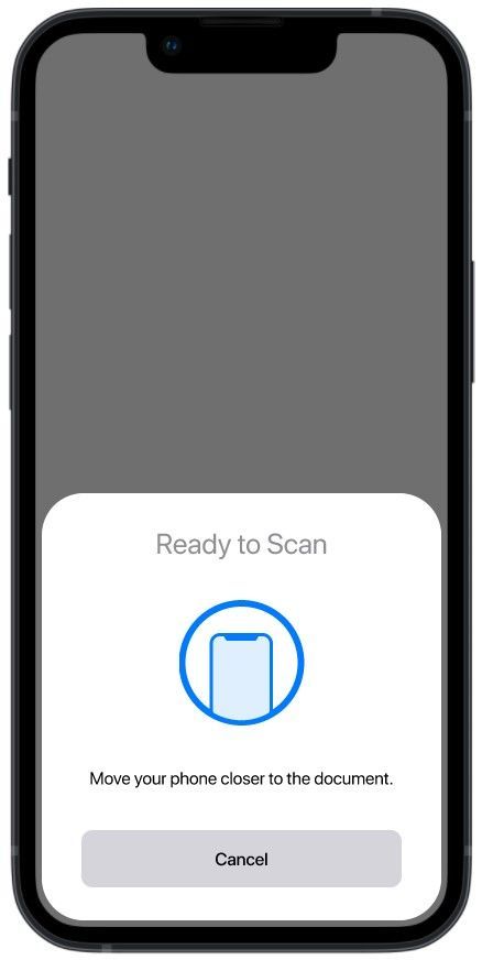
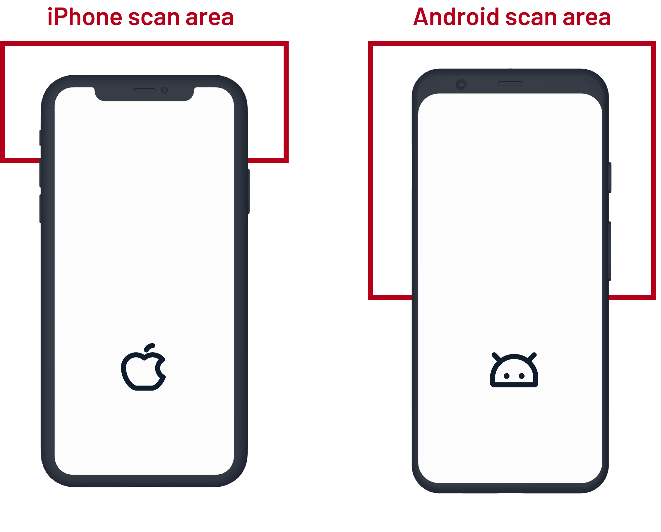
Each platform approaches the use of NFC technology differently. On iOS, when activating the NFC scan, a system modal pops up from the bottom of the screen (see image below), which complicates the visual design of the entire transaction process. However, the biggest problem is the placement of the chip itself in the phone. On the iPhone, it is always at the top, but on Android it can be anywhere in the upper half (see image below). To make the transaction as fast as possible, the phone NFC module must be as close as possible to the chip in the ID document.


3. Users don’t know how to correctly scan the ID card with their smartphone
On Android, unlike iOS, the NFC module needs to be activated in the phone settings. One of the most common use cases for NFC technology currently is contactless mobile payments. Just add your payment card to the digital wallet on your smartphone via Google Pay or Apple Pay and tap the payment terminal to pay. This operation is very fast - usually under one second because only a small amount of data is transferred.
When reading data from an ID document, the situation is different. The communication does not take place between two active devices (peer-to-peer), but the ID document is considered a passive device (tag) and is powered by a smartphone after the transfer is established. In this case, we transfer a larger amount of data (photos, personal data) to the phone, i.e., it’s not enough to tap the phone to the card, but to hold it in this position for some time. Establishing a connection and transferring the data takes two to four seconds.
Usability testing
The goal of our usability testing sessions was to read personal data from the user’s ID card to their phone.
All the prototypes shown below are for Android. For a better UX, we decided to visually distinguish between these states:
- Discover and establish connection
- Handshake
- Transfer data
- Success/error
First iteration
During usability testing, we found that the animation is completely misleading. As you can see in the prototype, the card is circling around behind the phone. We realized that the smartphone and the ID card must be held still to establish the connection. Establishing a connection takes a bit longer on Android, and a lot of users tried several times to transfer the data but were unsuccessful.
Second iteration
We tweaked the text and completely changed the animation. The ID card is held still and the phone is approaching the card. (The animation is a bit different on Android.) The smartphone is not only approaching the card, but also sliding up and down because the NFC module on Android can be anywhere in the upper half. The result was much better than the first iteration, but we also got ideas for further improvements from several users that we decided to implement.
Third iteration
We've polished the text a bit and added a few elements such as:
- A tooltip that highlights the subsequent steps for the user
- A button with a link to the video tutorial
- An information box that appears if the search takes longer than expected
Final version for iOS
For comparison, here is the final prototype for the iOS platform
Conclusion
To make the NFC flow clear to the users, we had to refine the process three times. The next challenge is to explore the UX for another type of ID document: a passport.


