How to Build a Product Configurator Using 3D Parametric Models
Learn how parametric models power custom configurators for made-to-measure furniture. Discover how parametric furniture 3D models enable real-time design, pricing, and CNC-ready outputs.
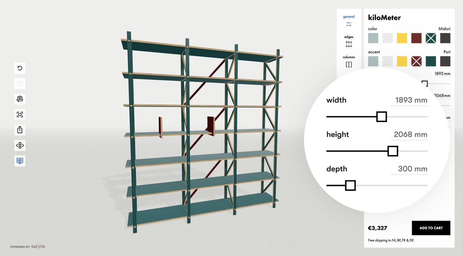
Selling customizable products like shelving or cabinetry comes with a unique challenge: every product needs to adapt to different sizes, layouts, and materials. You can’t rely on static 3D models or a library of fixed variants. Instead, you need a smarter, more flexible approach. That’s where parametric models come in.
In this article, you’ll learn how 3D parametric models make it possible to build product configurators for made-to-measure products. We’ll explain how they work, why they matter, and show how one parametric furniture brand brought its entire catalog online — with full dimensional control, live pricing, and production-ready outputs.
What Are 3D Parametric Models?
Parametric models are 3D models that adjust automatically based on variable inputs called parameters. Instead of representing a fixed object, they represent a set of rules.
For example, a parametric cabinet doesn’t exist as one model. It exists as a flexible design system that changes when you adjust:
- Width, height, and depth
- Number of shelves or doors
- Materials and finishes
- Functional add-ons like drawers, legs, or lighting
Each of these inputs modifies the model in real time — both visually and structurally.
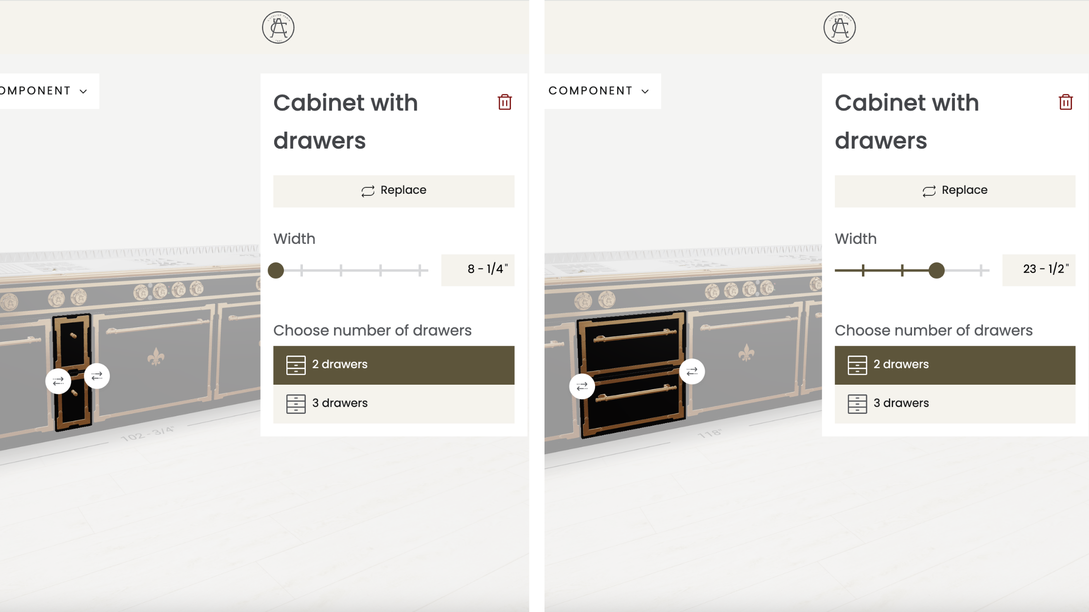
Unlike static models, 3D parametric models don’t need to be re-designed for every configuration. One smart, rule-based model can generate thousands of valid variants on demand.
Why Use Parametric Models in a 3D Configurator?
For highly customizable products like parametric furniture, modular shelving systems, or made-to-measure cabinetry, using static 3D models is limiting. You can’t reflect dimensional changes, enforce build rules, or scale the visual experience without constant manual work.

That’s where 3D parametric models come in. They allow users to customize dimensions with millimeter precision, unlocking all the possibilities your product offers while keeping the logic:
- Real-Time Feedback: Users instantly see how their selections affect the product. Dimensions and prices update, new modules appear, and incompatible options are removed.
- Scalable 3D Visualization: You don’t need to pre-render every variant. With parametric logic, the model builds itself based on rules and dimensions.
- Manufacturing Accuracy: Every configuration is buildable. The system applies product rules as the user configures, ensuring that what’s visualized can actually be produced.
Real Life Example: Building a 3D Configurator for Parametric Furniture
The Challenge: Bringing Custom Furniture Online
KILO is a furniture design studio specializing in made-to-measure pieces, including modular shelving, tables, and other customizable products. Their furniture is CNC-manufactured, built to order, and designed to adapt to the exact needs of each customer, down to the millimeter.
KILO came to Salsita with one challenge: bringing that flexibility online. They wanted customers to be able to design their own shelving systems directly through a 3D configurator: adjusting dimensions, layout, and features in real time, with full visual and technical accuracy.
Our Solution: A 3D Configurator Built on Parametric Logic
To deliver a truly dynamic experience, we built the configurator using 3D parametric models. The product was broken down into modular components—columns, boxes, dividers, and panels—each generated in real time based on the user's inputs.
Instead of using fixed geometry, we relied on a custom JavaScript-based DSL (Domain Specific Language) to describe the shape of each component. This made it easy to use variables like height and width, allowing the model to adapt instantly as users adjusted sliders and layout options.
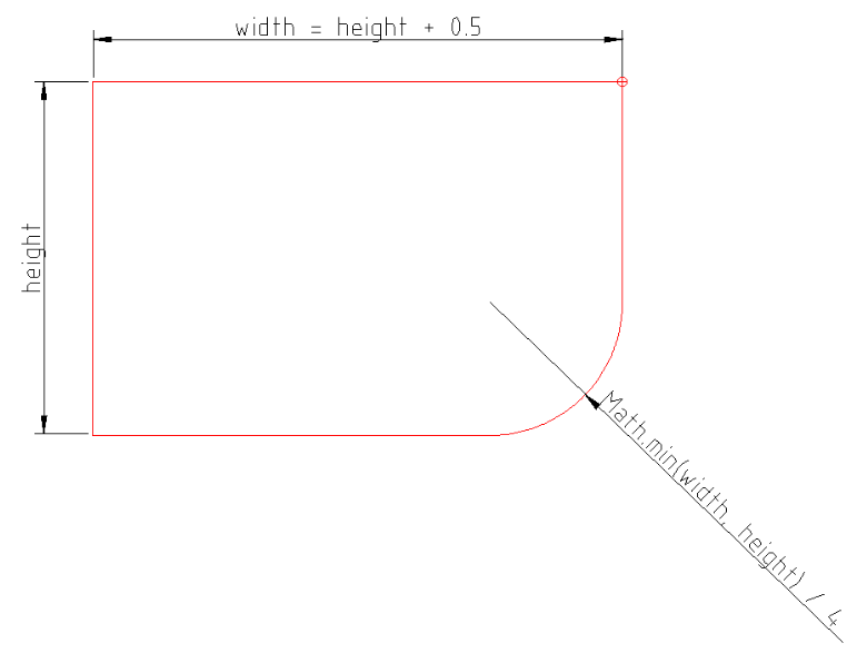
For example, this small snippet dynamically defines a rectangle with a rounded corner using input dimensions:
const height = 1
const width = height + 0.5

const shape: ShapeElement[] = [
  { corner: [0, 0] },
  {
    corner: [width, 0],
    radius: Math.min(width / height) / 4
  },
  { corner: [width, height] },
  { corner: [0, height] }
]
We then pass these shapes through rendering routines that convert them into 3D extrusions for the model, SVG previews, or DXF files. Because the DSL runs in both Node.js and the browser (written in TypeScript), it's easy to use the same logic for frontend rendering and backend processing.
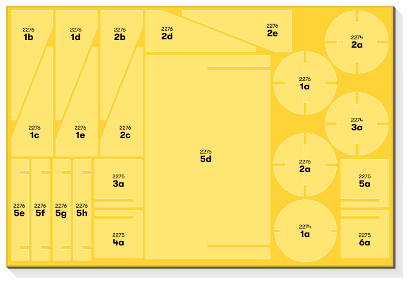
The same system also powers KILO’s production workflow, including order grouping, automatic nesting of parts, and DXF export of fully-nested sheets for CNC machining. This ensures what customers see and configure online is exactly what gets produced.
Making Parametric Models Look Real
At the start of the project, KILO was unsure about using 3D models at all. They were concerned that parametric visuals would look too artificial or cartoonish — something that could hurt the perceived quality of their product.
But thanks to the clean shapes of their furniture, we knew a well-executed model could strike the right balance. We photographed real plywood samples using a mid-range smartphone to capture the edge texture, and applied a subtle bump map to mimic the laminated surface. This gave the product a tangible look that matched the real material.
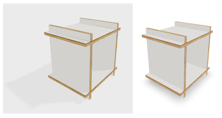
Lighting was another key factor. Achieving realistic shadows without distorting colors was a constant balancing act. We fine-tuned light settings and even adjusted certain colors — like making black slightly lighter — to avoid unnatural, overly dark results.
As rendering got more detailed, we started facing performance issues. To address this, we used GPU detection to display full shadows on high-end devices, while switching to contact shadows on lower-end ones. These lightweight shadows gave the object visual grounding without sacrificing performance.
What We Learned
KILO 3D configurator showed how powerful parametric models can be when applied with the right structure and attention to detail. We learned that:
- Parametric logic makes it possible to generate accurate models, outputs, and pricing — all from the same data.
- Clean, modular geometry keeps complexity under control, even for highly customizable products.
- Visual quality matters just as much as technical accuracy — especially for premium furniture brands.
- Performance can’t be an afterthought. Smart fallback strategies ensure consistency across devices.
Most importantly, it proved that 3D parametric models aren’t just a way to build dynamic visuals. They’re the foundation for configurators that scale from user input to CNC output with confidence.
Ready to Build Your Own 3D Configurator With Parametric Models?
If you offer customizable products and want to turn complexity into a smooth, visual experience, a 3D configurator with parametric models is the way to go.
At Salsita, we specialize in building 3D configurators that not only look great but generate accurate quotes, outputs, and production data in real time.
Whether you’re starting from scratch or upgrading an existing tool, we’ll help you bring your product logic to life with a tailored and scalable solution.
Let’s talk, book a personalized demo:

